
9 Ways to Make Big Data Visual (Updated for 2026)
.jpg)
The original article was written on 13.06.2017, updated on 23.02.2026.
Data Visualization: Then and Now (Updated for 2026)
The Original Perspective: Why Visuals Matter in a World of Big Data
“A picture is worth a thousand words.”
For years, that phrase anchored conversations around data visualization. As businesses entered the era of “Big Data,” organizations were suddenly overwhelmed by volume, velocity, and variety. The challenge wasn’t access to data, it was comprehension.
Back then, the core argument was simple:
- Humans process visuals faster than text
- Data was growing at an unprecedented rate
- Charts and dashboards helped prevent “information overload”
Common visualization formats dominated the conversation:
- Bar charts for comparisons
- Line graphs for trends over time
- Maps for geographic distribution
- Scatter plots for correlations
- Infographics for shareable insights
- Pie charts (controversial, even then)
- Timelines and tree diagrams for structure

The message was clear:
Collect data → visualize it → make better decisions.
At the time, visualization was often seen as the final step, something you did after analysis was complete. The emphasis was on presenting results in a way stakeholders could understand.
But that was then.
What’s Changed in 2026
The role of data visualization has evolved dramatically.
Today, visualization isn’t the final step. It’s an active part of decision-making infrastructure.
1. We’ve Moved from Static Charts to Real-Time Dashboards
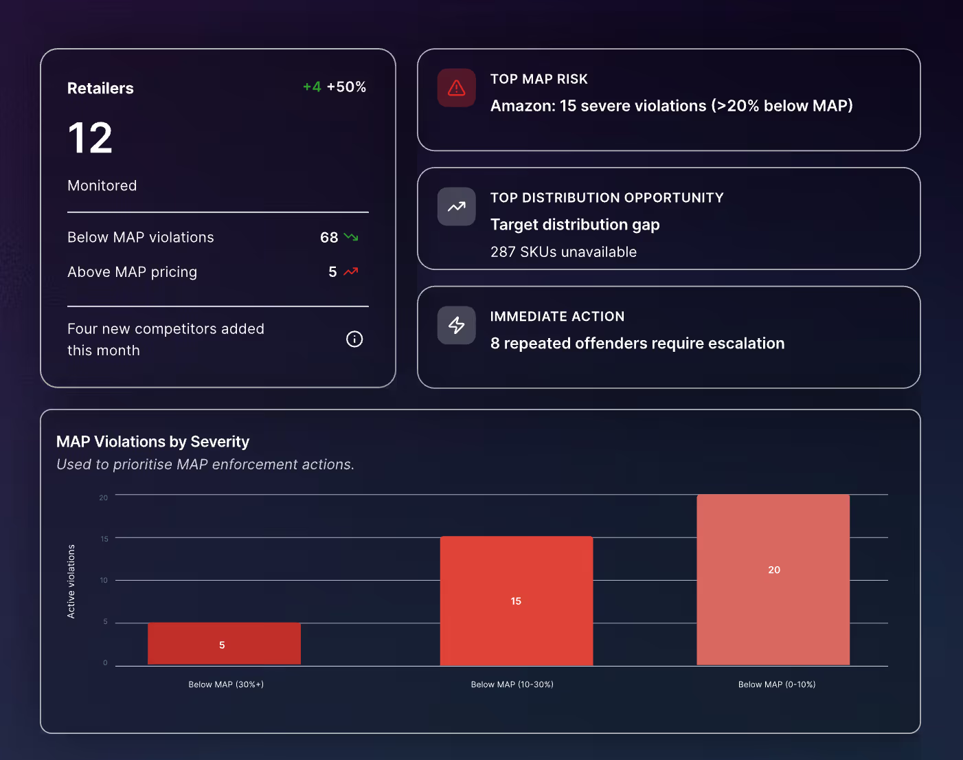
In the past, reports were monthly or quarterly. Now, organizations operate in real time.
Dashboards update continuously. Teams monitor:
- Live pricing changes
- Real-time supply chain performance
- Streaming customer sentiment
- Market fluctuations
Visualization is no longer just explanatory, it’s operational.
2. AI and Predictive Analytics Changed the Story
Previously, visualizations mainly described historical data.
In 2026, visualizations increasingly reflect:
- Predictive forecasts
- Scenario modeling
- Anomaly detection
- Automated insights
Line charts now project forward. Heatmaps highlight risk zones before issues occur. Dashboards trigger alerts automatically.
Visualization has shifted from “What happened?” to “What’s likely to happen next?”
3. External Web Data Is Now Core to Visualization
Originally, most dashboards relied on internal data, sales numbers, operational metrics, CRM data.
Today, competitive intelligence and market awareness require external signals:
- Competitor pricing
- Product availability
- Customer reviews
- Industry updates
- Marketplace trends
Much of that data lives unstructured on the web.
Platforms like Import.io now play a critical role in feeding visualization tools with structured web data. Instead of manually collecting competitor information or relying on incomplete datasets, businesses integrate web data directly into BI dashboards and analytics systems.
Visualization has expanded beyond internal reporting, it now reflects the entire market environment.
4. Simplicity Matters More Than Ever
Despite advances in tooling, one thing hasn’t changed:
Clarity wins.
In fact, as dashboards grow more powerful, the risk of clutter grows too. In 2026, the best visualizations:
- Focus on one key insight per view
- Minimize unnecessary design elements
- Highlight anomalies clearly
- Guide decision-making, not overwhelm it
The fundamentals still apply:
- Bar charts for comparison
- Line charts for trends
- Scatter plots for relationships
- Maps for geography

The tools may be more advanced, but the principles remain timeless.
The New Standard: Storytelling with Live Data
Originally, data visualization helped prevent “drowning in text.”
Now, it helps prevent drowning in dashboards.
The goal today isn’t just to show data, it’s to build systems that:
- Update automatically
- Integrate internal and external sources
- Surface actionable insights
- Support AI-driven decisions
Visualization has evolved from a communication tool into a strategic capability.
Final Perspective
The original argument still holds: visuals help us understand complex information quickly.
But in 2026, visualization is no longer optional or decorative. It is embedded in how modern organizations operate.
The difference between companies that simply collect data and those that compete with it often comes down to one thing:
Not how much data they have, but how clearly they can see it.
Need the underlying data first? Free 30-day extraction trial.
