
What is data visualization and why is it important?
What Is Data Visualization and Why Is It Important
Data has never been more abundant, but volume alone does not create understanding. Organisations make better decisions when information is clear, contextual and easy to interpret. Data visualization is the discipline that makes this possible.
What Data Visualization Means
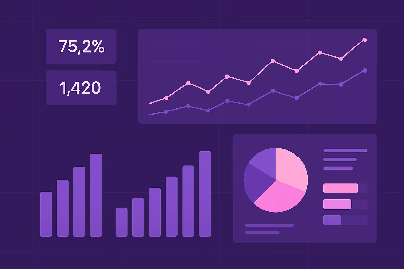
Data visualization is the practice of turning raw data into charts, graphs, maps and dashboards so people can see patterns, relationships and changes quickly. Instead of scanning thousands of rows in a spreadsheet, visualization helps teams understand what matters at a glance.
Well-designed visuals reveal the story behind the numbers. They highlight trends, outliers, risks and opportunities that are difficult to spot in table form.
Why Data Visualization Matters
1. Complex information becomes accessible
Large datasets are difficult to analyse manually. Visualization condenses complexity into formats that people can understand immediately, which reduces cognitive load and improves clarity.
2. Trends and anomalies stand out
Price shifts, stock changes, seasonal patterns and competitor behaviour become clearer when charted over time. Visual patterns help teams react faster and more confidently.
3. Better and faster decision making
Clear visuals make insights easier to communicate across departments. Executives, analysts and operational teams can align on the same information without misinterpretation.
4. Data becomes a shared language
Not everyone has a technical background. Visualization ensures teams across the organisation can interpret the same information and act with confidence.
5. Supports real-time monitoring
Dashboards allow teams to track KPIs, product performance, competitive landscapes and market signals as they change. This reduces the lag between insight and action.
Common Types of Visualizations
Why Visualization Matters for Web Data and Market Intelligence
Organisations that rely on external data, particularly for pricing and competitive analysis, often work with large and constantly changing datasets. Visualization plays a critical role in:
- Bringing structure to raw extracted data
- Surfacing competitor price changes or promotional behaviour
- Tracking assortment shifts and stock status
- Understanding long-term trends vs short-term fluctuations
- Communicating insights to commercial, category and leadership teams
Without visualization, valuable signals remain hidden. With it, external data becomes a source of strategic clarity.
Good Visualization Requires Good Data
Strong visuals rely on accurate, consistent and well-structured data. Clean schemas, clear field definitions and reliable extraction pipelines ensure that visual outputs are trustworthy. When the data foundation is stable, teams can focus on interpreting insights instead of fixing errors.
Conclusion
Data visualization is more than a way to present information. It is a core part of how businesses understand markets, communicate insights and make decisions with confidence.
As external data becomes increasingly central to pricing, competitive intelligence and operational planning, the ability to visualise it well becomes essential. Organisations that invest in strong visualization practices move faster, see more clearly and gain a meaningful advantage in understanding a changing landscape.
Turn normalized data into clear, reliable visuals. Start a Free Trial or speak with a data specialist about delivering structured datasets ready for dashboards and analysis.
