
8 Fantastic examples of data storytelling

What is Data Storytelling?
Data storytelling is the process of creating a story out of data analysis findings, allowing regular business people (laymen) to understand the possibly complex insights and apply them to a business decision or action.
As big data becomes more prevalent in organizations, data storytelling becomes more important. Insight gained from big data analysis needs to be communicated to people who aren’t familiar with the data in a way that they will understand.
Crafting a narrative is the most effective way to communicate, and visuals are the easiest medium for the human brain to understand. Therefore, data storytelling with visualizations is the most effective way to present data.
Why is Data Storytelling So Important?
Data storytelling is important because it communicates data insights in a way that any person would understand, without being familiar with data analysis at all. When we see great data storytelling, we’re seeing the realization of great data visualization. We’re seeing data that’s been analyzed well and presented in a way that someone who’s never even heard of data science can get it. Storytelling with data visualization is a valuable skill to understand and develop. Data insights are potentially worthless if you can’t communicate them to the right people in the right way.
Allowing Google’s Cole Nussbaumer to provide a friendly reminder of what data storytelling actually is, it’s straightforward, strategic, elegant, and simple. These fantastic data storytelling examples below aren’t necessarily flashy, but their genius is in their ability to communicate rich ideas as stories in the simplest terms.
Allow them to inspire you to do the same.
1. Minard’s Map of Napoleon’s Russian Campaign in 1812
Charles Joseph Minard's flow map is a classic example of data storytelling, combining multiple variables into a single, comprehensible visual. It illustrates the losses suffered by Napoleon's army during the Russian campaign of 1812.
This map is widely regarded as one of the most effective examples of data visualization, demonstrating how complex historical data can be communicated through a single, well-designed graphic.
Learn more:
- Analyzing Minard's Visualization of Napoleon's 1812 March – Thoughtbot
- Charles Minard: The Underappreciated Man Behind the “Best Graphic Ever Produced” – National Geographic
2. New York’s Noisiest Neighborhoods
This one comes from Ben Wellington, of I Quant New York, writing for The New Yorker (the same guy that helped figure out how to calculate a balance-free metro card).
In an article, he used data points from New York City noise complaints not only to map out which neighborhoods were noisiest, but why they were noisy. From the screenshot above, you can see that you’ll definitely want to steer clear of two neighborhoods near the Bronx if you hate the sound of ice cream trucks.
Learn more:
- Mapping New York's Noisiest Neighborhoods – The New Yorker
- Making Data Mean More Through Storytelling – Ben Wellington's TEDxTalk
3. 40 Years of America’s Eating Habits
In an article from Danielle Kurtzleben of Vox, she uses data points from the USDA to quantify the statement, “You don’t eat the way your parents did.”
Rather than showing year by year by year comparisons for each different food item, the chart displays the difference over a multi-decade period, organized that decreases in consumption and then shifting into increases.
Based on the way it starts, and the long nature of the chart, you may think that it’s going to prove we’re so much healthier. Instead it goes on to show dramatic increases in both positive and negative ingredients—accurately reflecting changes without pushing one nutritional point unfairly over another.
Learn more:
4. 100,000 Stars
While 3D may not always be lauded as the ideal, this certainly proves its utility, especially in this complex, nearly unfathomable subject of light years.
It can be hard to visualize the actual size of our solar system, let alone galaxy, or universe. These guys try to make it possible, using data and pictures together. The 100,000 Stars site puts scientific data about the size of our universe into more palatable terms.
When you elect to have a “tour” of the vast map on your screen, you’re taken through a slow series of statistic and 3D visuals that show you just how big our galaxy is, relative to our solar system. While we can’t visualize light years when we see it as a number on a screen, this gives us the visual tools we need to put it in terms we can better understand.
Learn more:
- 100,000 Stars – Google Chrome Experiments
- Google's Interactive 100,000 Stars Lets You Spin Round the Galaxy – Wired
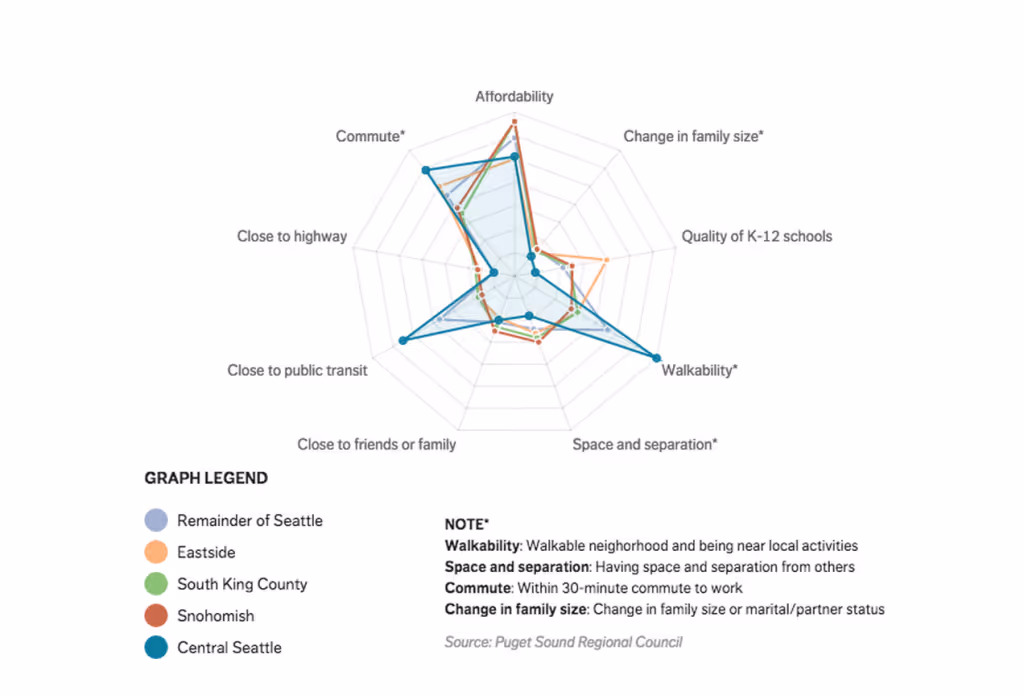
5. How Seattle Residents Determine Housing
Housing is always an interesting subject, especially when it begins to lead into other discussions like gentrification. This visual data storytelling from The Seattle Times does an amazing job of clearing the facts up.
As you can see, for most neighborhoods, the same concerns are nearly universal. Most people (except downtowners, where rent is more expensive) care about affordability the most. Relatively speaking, those same people all care the same amount about quality of school, commute, and care little about change in family size.
It also demonstrates more easily the correlation that people who care about walking distance probably care about proximity to public transportation. While these correlations may not be the same for every major city, it presents a comprehensive way to visualize a broad amount of surveyed information.
Learn more:
- 8 Data Storytelling Concepts (with Examples!) – Two Octobers
6. How Machines Destroy/Create Jobs
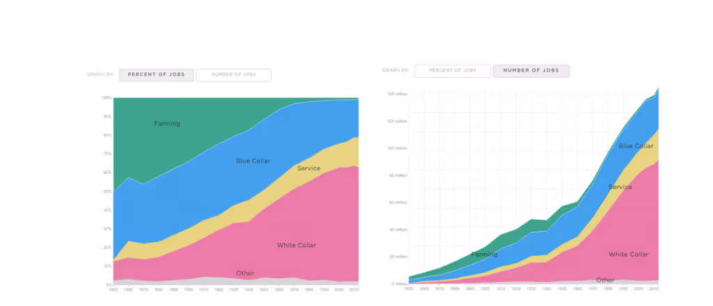
These two charts from npr.org do an incredible job of showing what the rise of machines has really done to American jobs.
In 1850, as the graph will tell you when you scroll over it, there were roughly 2.6 million working farmers in the U.S., and in 2013, there were roughly 1.6 million. In 1850, 51% of American workers were farmers, in 2013, only 1% were (no, a different 1%).
You don’t have to be a math genius to understand that that doesn’t mean the economy is in shambles because we don’t have more working farmers—it just means that as the rise of machines in jobs happened and working population grew, people flocked mostly to white collar jobs.
Rather than showing the shifts in unemployment, they’re showing the shift in the job landscape, creating a more realistic picture in answering a question like “what happened because of x?”
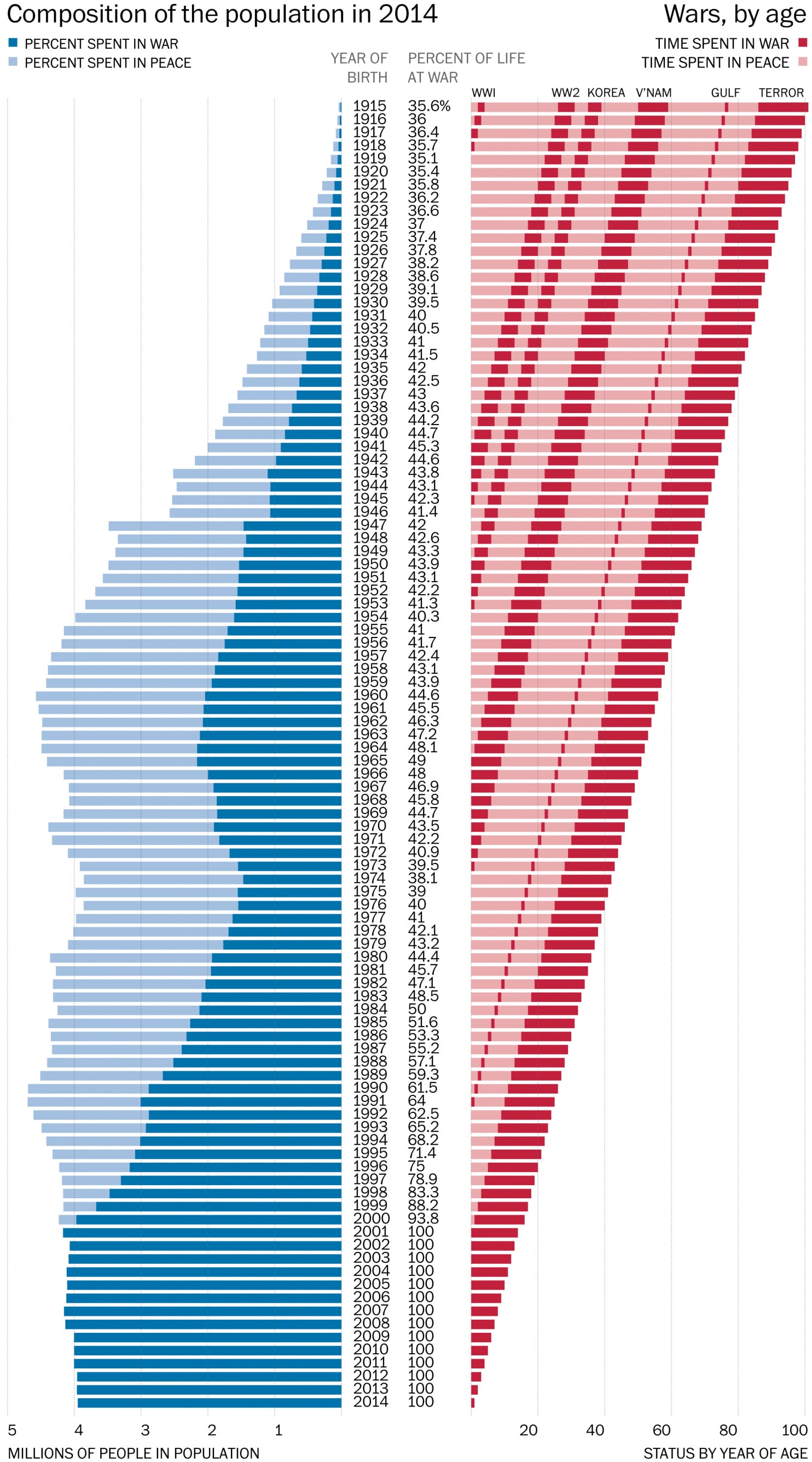
7. How Much of Your Life the U.S. Has Been at War
The Washington Post visualizes the duration of U.S. involvement in wars, providing a historical perspective. Explore the visualization here.
Learn more:
- Here's How Much of Your Life the United States Has Been at War – Washington Post
- How Much of Your Life Has the U.S. Been at War? – Storytelling with Data Community
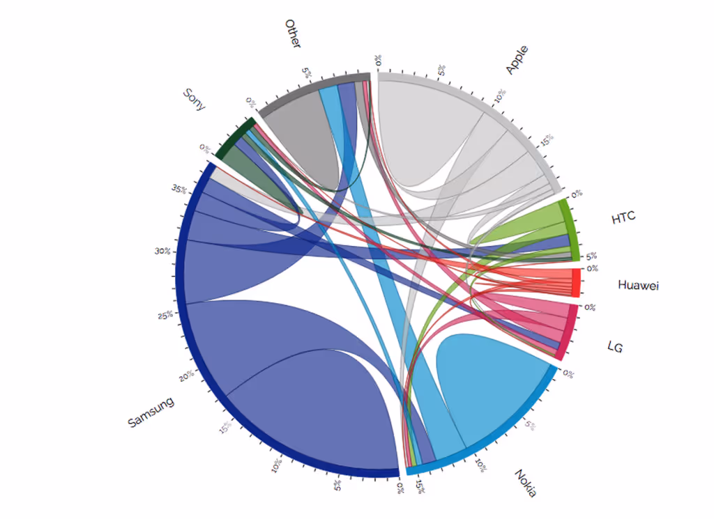
8. A Chord Diagram Showing Phone Habits
Visual Cinnamon's interactive chord diagram illustrates consumer behavior in the mobile phone market. Check it out here.
Learn more:
- Using “Data Storytelling” with a Chord Diagram – Visual Cinnamon
- Switching Between Phone Brands – Visual Cinnamon
As this list demonstrates, there’s no one way to tell a great story with your data. Each of these charts, graphs and pictures showcases the simplest method of presenting data, without compromising clarity or volume of information. Be inspired to tell your data story well!
Import.io provides a solution for organizations to take data from anywhere on the web, prepare and cleanse it, integrate it into other systems, and create visualizations to illustrate the findings. Contact a data expert today to learn more about how Import.io can help your organization leverage data storytelling.

Learn more:
